
![32 AI eCommerce Tools To Start Using Today [2024]](https://www.groovecommerce.com/hubfs/2023%20Website/Blogs/AI%20Blog%20Social%20Media%20Tools/7%20AI%20Tools%20For%20eCommerce%20Merchants%20To%20Start%20Using%20Today%20-%20Promo%20Image%20Large.jpeg)


Recently, I had the extreme pleasure of traveling to the Bahamas for some summertime R&R. Like most other people in the 21st century, even on vacation I have trouble unplugging. So, I found myself in my hotel room trying to buy myself internet access. And, lucky for the hotel and internet provider, I was pretty desperate to get online, and I trudged through their insecure checkout process.
I'll keep this Design 1, 2, 3 short and sweet like a beach novel.
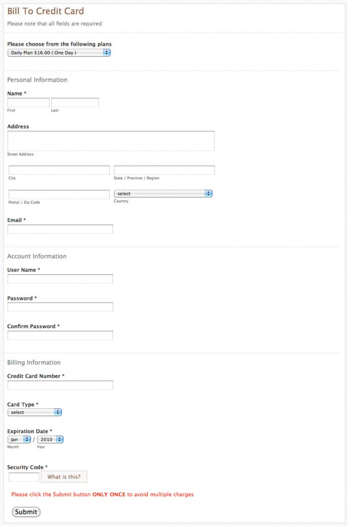
The checkout page for internet access was bare bones. Take a look:

Can you spot some trouble areas?
1. User Confusion
Did you notice the line of text that reads, "Please note all fields are required." Yet, some headers include an asterisks (ex: Name) but some don't (ex: Address). Some text is bold, mainly headers, while others aren't (ex: First Name.) Boldness and asterisks are generally key indicators for required fields on forms, yet this form doesn't adhere to either visual practice.

On a similar note, if a field isn't required -- again, it's unclear if the Address section is required -- don't include. Ideally short forms can be filled out faster and with fewer errors. Cut out the excess!
2. Assurance & Confidence
Did you notice anything missing from this page? Basically, any possible piece of information to build a user's confidence has been stripped away -- including the hotel's logo, contact information, as well as any type of security seal. (Disclaimer: Sometimes I cut out a company's logo in these Design 1, 2, 3 posts, but such is not the case here.)

Clearly my beef is mostly with the lack of security seal. In fact, the checkout page wasn't encrypted at all. I know, I know, I live a risky online life considering I'm still willing to put in my credit card number without anyone telling me it's safe to do so. But the rest of you should never ever do this, nor expect your customers to do so.
3. Technical Error
A few years ago, it was fairly common to see the statement, "Please click the submit button ONLY ONCE to avoid multiple charges," when placing an order online. This simple instruction is really a lazy way around a simple technical issue.

If you don't want users to click the button more than once, turn the button "off" after it's been clicked. Disable the button as the order is being processed, so the user cannot click the button more than once. It's a simple solution to a common problem, and a better solution than the line of text because a user might not read it, or might because unnecessarily worried about multiple charges potentially leading to cart abandonment.
While some of these errors may be small -- there's no reason to let them slide by. True, I made it through the checkout, but I didn't feel confident doing so, and I repeatedly hesitated before making, and I know I wouldn't do it again.
Lesson learned eTailers? If so, class dismissed and enjoy your summer.
Mentioned in this Post
Internet Sign-up :: Nassau Palms Hotel